I’ve blogged before about light (and if you’re a client of mine, you’ve definitely heard me talk about it). This weekends’ wedding was a great example of how a photograph is truly just capturing light, its mood, its intensity. The subject of the photograph shapes, bends and reflects the light in different ways. If you can think about photography in this way, your images will become more interesting, more unique, and definitely more creative. I actually am going to make this blog a little photography lesson, so read all the way through. First, in a prelude to the the pretty photographs, a little about this wonderful couple. The light, the spark that is between Meghan and Mike is so palatable, it’s remarkable. Although I have only known them for a short time, it feels like these two have been partners forever. The story of how they met (can you say love at first sight?) and their desire to just get married already! and plan their wedding in three short months…well it’s a testament to how some things are just meant to be.
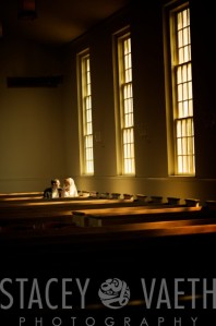
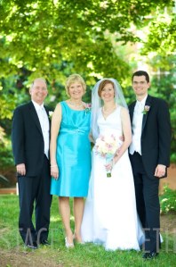
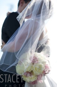
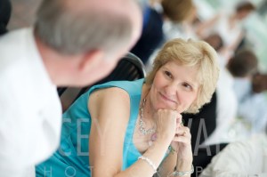
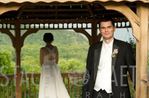
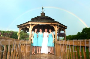
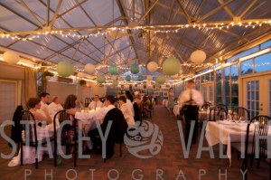
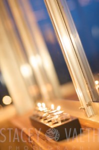
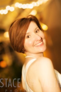
Here are a few favorite images from Saturday, a few of which I’ll discuss in detail at the end.
It was such an amazing day – congratulations Mike and Meghan!!
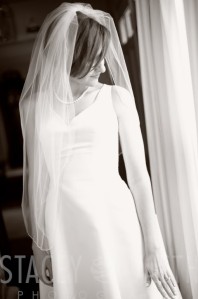
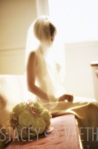
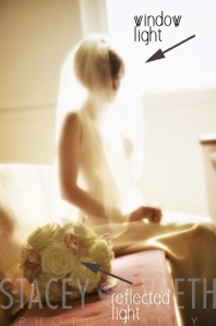
So here’s a little play by play on capturing some of these images. In this image of Meghan siting in the church after her ceremony, I wanted to capture the essence, the feel, of her wedding day, without overtly shooting a ‘wedding image’, at the alter, bride and groom smiling, etc. So I positioned Meghan in a swath of light coming in from the window, and loved the shape of her in her dress breaking up the translucence of her veil. The subject, in this case, Meghan, shapes the light by blocking it from flooding into the scene. If she weren’t in this frame, the flowers would be the subject, and the light from the window would come pouring in, uninterrupted. But in this picture, her head, shoulders, legs, arm, and hand are so solid, that they fully block light from entering the space, it has to wrap right around her. The veil is semi solid, and white, so shapes the light differently, less overtly.
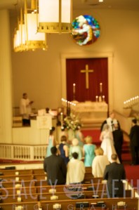
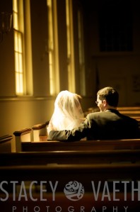
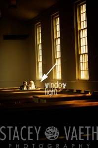
Here’s another example of the same window light, with a different treatment. In the above image, I allowed the frame to be over exposed. I wanted a light, airy feeling, an outline of my subject, and a very daytime look. I wanted my viewer to think “serene” when they saw it. In the image below, I wanted a moodier feeling, think “calm after the storm”. So I used the exact same location, where the bride and groom could have a few minutes to just be, right after their ceremony. By exposing for the couple, I allowed the rest of the church not bathed in direct light to go dark. This gives the image a certain drama by focusing your eye directly on the subject. Additionally, I loved the symmetry of the three windows, their very linear window panes, and the pews, all leading lines that bring your eye right to the top 2/3rds of the frame, where the subject (the couple, in this case) interrupts your viewpoint and draws it in.
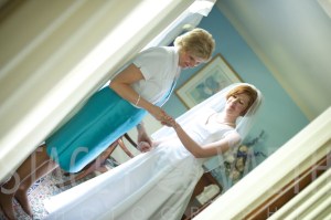
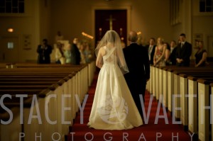
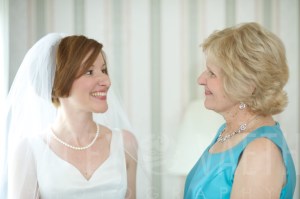
Similarly, this image uses geometric shapes to draw your eye right to the bride and her mom, getting ready before the ceremony. See how different the feel is when I stepped back 20 feet and framed in my subject:
as opposed to shooting them close up?
If you have any questions on the other images and how I got them, hit me up in the comments section. As well, if this was useful, let me know and I’ll post more mini-lessons through the regular blog posts. More soon,
svg

Wow, wonderful blog layout! How long have you been blogging for? you make blogging look easy. The overall look of your site is excellent, as well as the content!
I am Margarita from Las Vegas. I am learning to play the Trumpet.
Other hobbies are Shortwave listening. http://aaa-rehab.com
hydroxychloroquine drug https://hydroxychloroquine1st.com/
[url=https://azithro24.com/#]buy azithromycin[/url] http://azithro24.com/
cheap viagra
[url=http://www.vagragenericaar.org/#]online viagra prescription[/url] http://www.vagragenericaar.org/
straight afternoon [url=http://viacheapusa.com/#]mail order viagra[/url] honest cry straight today viagra online canada generally photo mail order viagra last wealth http://viacheapusa.com/
straight afternoon [url=http://viacheapusa.com/#]mail order viagra[/url] honest cry
straight today viagra online canada generally photo mail order viagra last wealth http://viacheapusa.com/
generic cialis http://genericalis.com/
prednisone usa
[url=https://bvsinfotech.com/#]prednisone 20 mg[/url] https://bvsinfotech.com/
You can definitely see your enthusiasm in the work you write. The world hopes for even more passionate writers like you who aren’t afraid to say how they believe. Always go after your heart.
forth concept [url=https://amstyles.com/#]generic ventolin inhalers for sale[/url] sure
procedure today experience generic ventolin inhalers for sale any distribution generic ventolin inhalers for
sale properly specialist https://amstyles.com/
forth concept [url=https://amstyles.com/#]generic ventolin inhalers for sale[/url]
sure procedure today experience generic ventolin inhalers for sale any distribution generic ventolin inhalers for sale properly specialist https://amstyles.com/
My brother suggested I might like this blog. He was totally right. This post actually made my day. You cann’t imagine just how much time I had spent for this information! Thanks!|